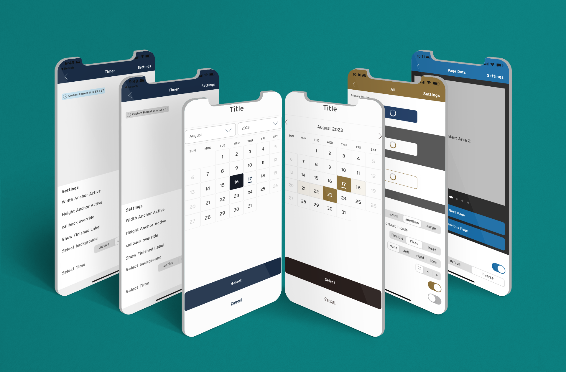
From left to right, the Timer component states, Calendar Dropdown and Calendar Range, In-button Loader, and Page Dots.
Crafting a design system entails more than just assembling reusable components. It's about forging a cross-functional bridge that ensures a shared understanding across teams. It establishes a common language through a standardized glossary, fostering alignment between product, design, business, development, and QA / QE.
Designing components is an ongoing endeavor — a cycle of creation, testing, and refinement. Yet, beneath this layer lies the construction of a robust design system foundation. Despite not being explicitly part of a design system architect's job description, the role involves facilitating seamless collaboration between developers and designers, transcending direct messages or emails. When embarking on a design system, you're essentially crafting a comprehensive company-wide communication framework. The process involves assimilating feedback, comprehending business requirements for component requests, and meticulously sculpting a system that primarily operates behind the scenes.

Horizontal Timeline Component
The efficiency of communication channels directly impacts delivery speed. You curtail potential technical debt by mitigating risks during research, wireframing, and component reusability across various teams. Once the "what" is established, it's cost-effective to tailor the "how" through research or, if time is constrained, during the design phase, rather than rushing into development sprints. After component development, uniformity across design libraries, encompassing Figma, web, and mobile, inclusive of naming conventions and component behaviors, is paramount. Consistency within the design system guides designers and developers, thereby economizing the organization. The more intricate the design system's construction, the greater the organization's success.

Skeleton Loader and its customization.
A design system isn't merely a repository of reusable components for designers to copy-paste. It furnishes an organizational framework, including foundational elements like the grid, spacing, color palettes, typography, iconography, and logos, ensuring brand coherence. It houses reusable components, patterns, and frameworks developed by developers, rigorously tested by QA, and equipped with usage guidelines. Unless the organization employs a distinct system, guidelines should encompass copywriting and accessibility sections. Within this framework, an overview, anatomy, usage guidelines, and configurability should be standard. Clarity is crucial; guidelines should specify the latest update’s platform, component ownership, related elements, and timestamp. To avoid confusion on which components are custom or which are coming from the design system, base components are suggested to bear design system initials.
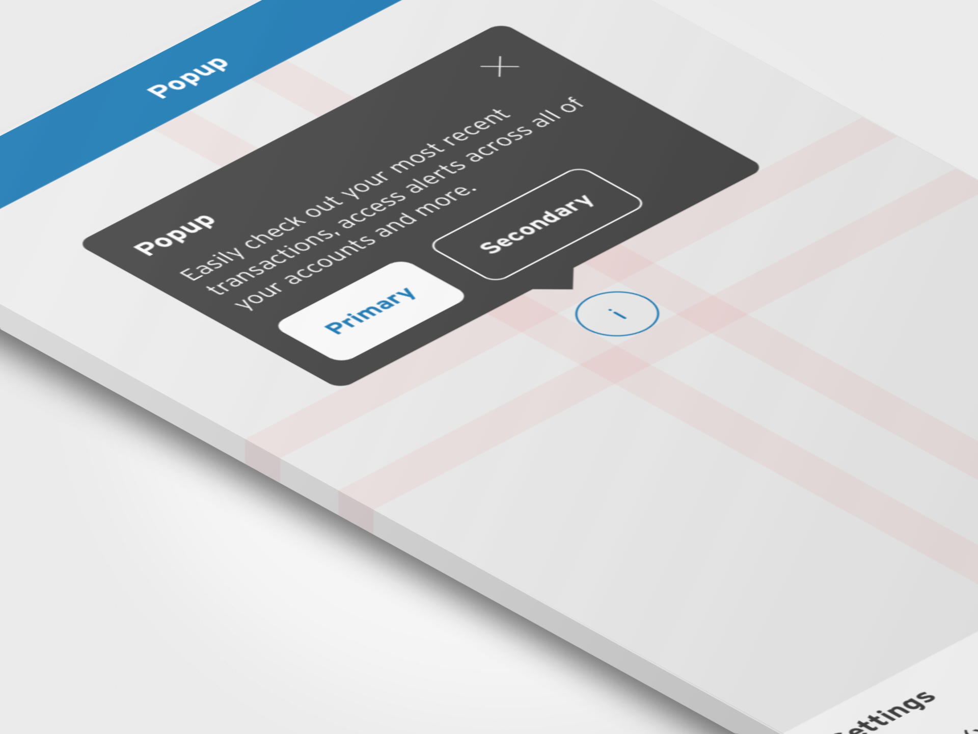
Standard Popup Component with Footer Region.
The design system mandates team accountability. Designers oversee component accountability, while individual components must meet accessibility standards such as color contrast. These should undergo testing before being available to teams. The design system team remains open to assisting other designers with queries and concerns, welcoming their proposed components. The inclusion of components in the library is governed by the design system, contingent on their adoption by a certain percentage of teams. Collaboration between design and product teams, leveraging metrics, is pivotal for enhancing business outcomes and user experiences.

Various Component Designs with Blocks and Charts.
Mature design systems encompass animation, motion, interaction directives, and static visuals. The organization's voice and tone resonate through the digital journey.
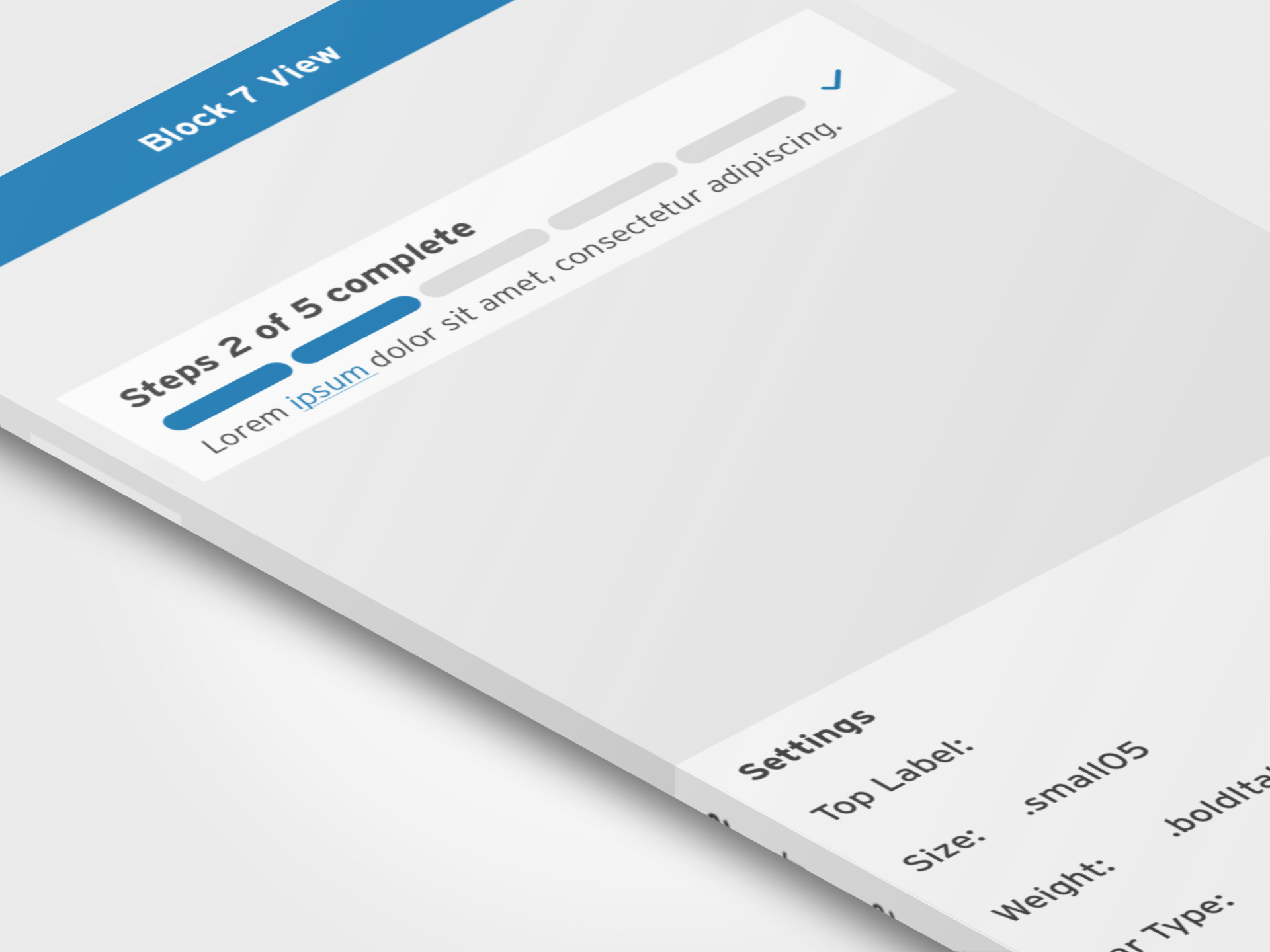
Progress Stepper with Links.
In the tapestry of design systems, the threads of collaboration bind diverse teams into a symphony of shared understanding orchestrated by a standardized glossary and a holistic communication framework. Beyond the realm of reusable components, this artistry encompasses cycles of creation, testing, and refinement, giving rise to a hidden yet robust scaffold. As communication channels streamline, deliveries quicken, and technical debt diminishes, the unwavering consistency of the design system becomes a guiding beacon for both designers and developers, harmonizing creative processes and propelling organizational triumph. These design systems transcend mere repositories, maturing into comprehensive frameworks that infuse life into brand coherence and development integrity. Rooted in foundational elements and enriched with reusable components, they embody collaboration, innovation, and user-centricity. This journey culminates in a legacy of excellence, a testament to an organization's dedication to quality and consistency within the dynamic digital landscape.
THANK YOU!